
VANGLAM 40: Coordinating Paper Colours Across a Packaging Set
Finding one colour you like is the easy part. The useful work begins when the box, carrier bag and enclosed card are seen together. VANGLAM 40 is QiLi Paper’s colour reference for making those decisions, not a promise that every paper finish looks identical.
Finding one colour you like is the easy part. The useful work begins when the box, carrier bag and enclosed card are seen together. VANGLAM 40 is QiLi Paper’s colour reference for making those decisions, not a promise that every paper finish looks identical.
Choose the dominant area
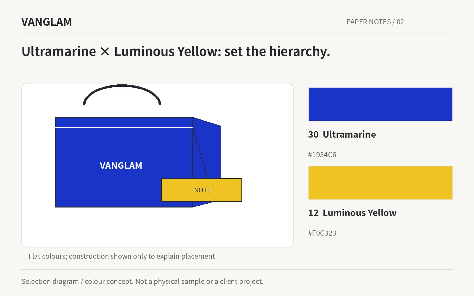
Try Mineral Green as the larger area and Almond Taupe on the information card. With Ultramarine and Luminous Yellow, make two layouts that reverse the dominant colour. The swatches stay the same, but the hierarchy changes.
Terracotta Clay with Olive Moss offers another starting point, while China Red with Champagne can be explored for gifting. These are design proposals using our palette, not client case studies or rules about which colours a category must use.
Original selection diagram / colour concept. Confirm paper, colour and processes physically.
Give every colour a name and a boundary
The system contains 40 named colours. The digital values recorded for 01–32 are shown as flat swatches below, without simulated lighting, texture or pearlescence. They support early design work; physical master samples remain the reference for material approval.
Names describe colours, not compositions. Natural Fibre is a colour name, not a fibre-content claim. Champagne does not automatically mean a metallic finish. Colour 03 Warm Porcelain and the HALO paper grade Warm Porcelain are also separate entries.
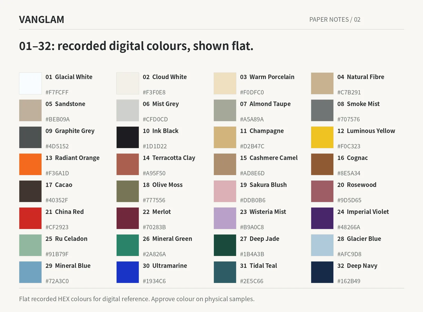
Digital reference: 01–32 use recorded flat HEX values, not physical material approvals.
Use physical samples for the additional eight
Emerald Green, Nocturne Blue, Reef Green, Oat Beige, Espresso Brown, Antique Bronze, Warm Greige and Silver Grey complete entries 33–40. Approved digital values for these eight are not included in the current publication data, so they appear by name rather than as invented swatches.
Once the palette is chosen, confirm the base paper, surface, grammage, size and supply conditions. Review each material version physically. A shared colour name connects the conversation; it does not remove the need to approve a pearl, uncoated or soft-touch version on its own merits.
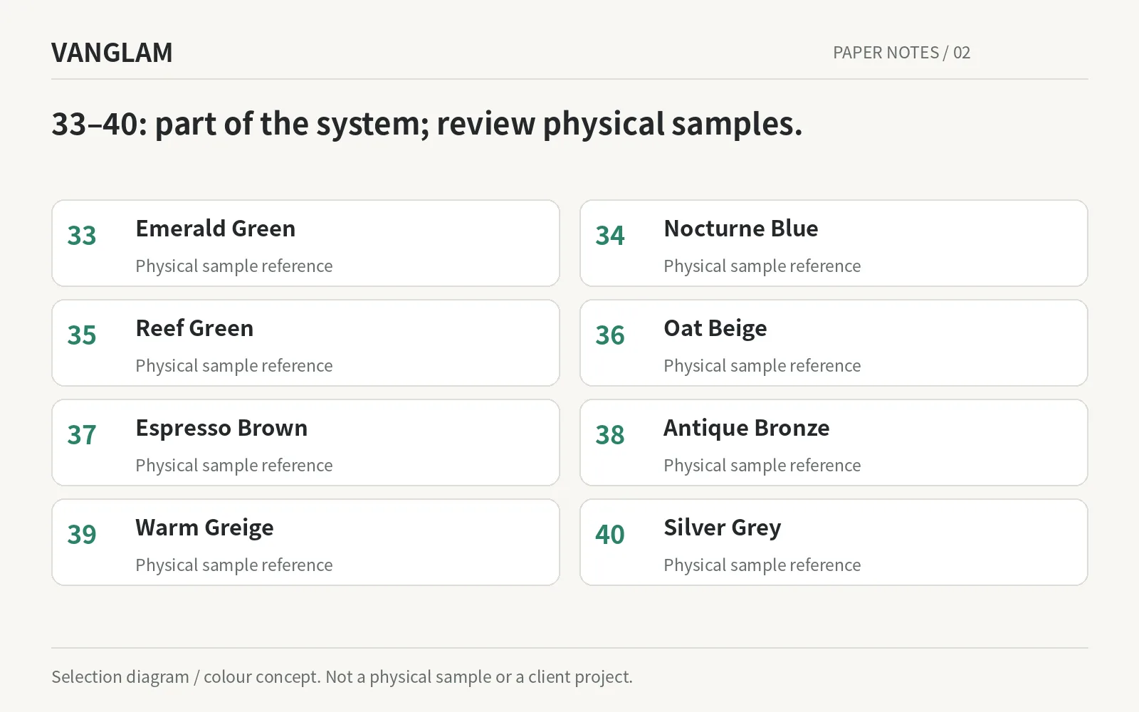
Entries 33–40 are included by name; no unapproved swatches are shown.
For a coordinated packaging set, send the product, component list and colour direction. Narrow the shortlist before requesting individual material versions.