
Terracotta Clay and Cognac: a restrained warm-color pairing
Let one warm color lead and the other appear inside. Compare area and contrast before adding decoration.
Build a sample with a clear lead
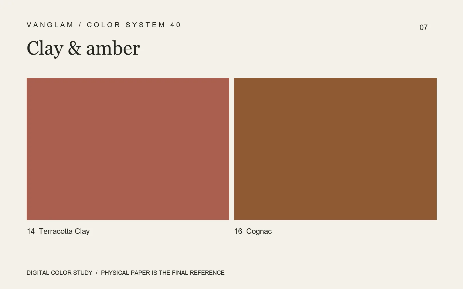
No. 14 Terracotta Clay and No. 16 Cognac form an original warm-color direction. Assign the exterior, liner and card to the two colors, then compare the experience before and after opening. A color name is not a performance statement.
Reduce repeated decoration
If color carries the main expression, give the typography room. Try a clear brand name, essential information and an enclosed card before deciding whether foil adds value. More processes do not necessarily make a stronger piece. Check foil contrast and fine-line continuity on the chosen paper.
For a darker detail, compare 17 Cacao. Color 18 Olive Moss offers another nature-associated naming direction. These are palette proposals; use paper samples to decide area and adjacency.
FAQ: Does Terracotta Clay contain clay, or does Cognac fit every wine project?
The names do not establish composition or application suitability. Wine and spirits packaging still needs project-specific checks for construction, rubbing, transport and use conditions.
Keep the material decision
Request both colors and record face, color combination and processing details. Approve the actual paper and finished proof so repeat orders can return to more than an image.
Cover: an original digital color study, not a physical paper specimen. Confirm color and surface with physical samples.