
Greeting Cards and Invitations: Paper, White Ink and Finishing
A line of white type on a dark background is simple to draw on screen. Producing it on a dark sheet requires a printing decision. With little text on a greeting card or invitation, it is worth considering the paper, type process and fold together.
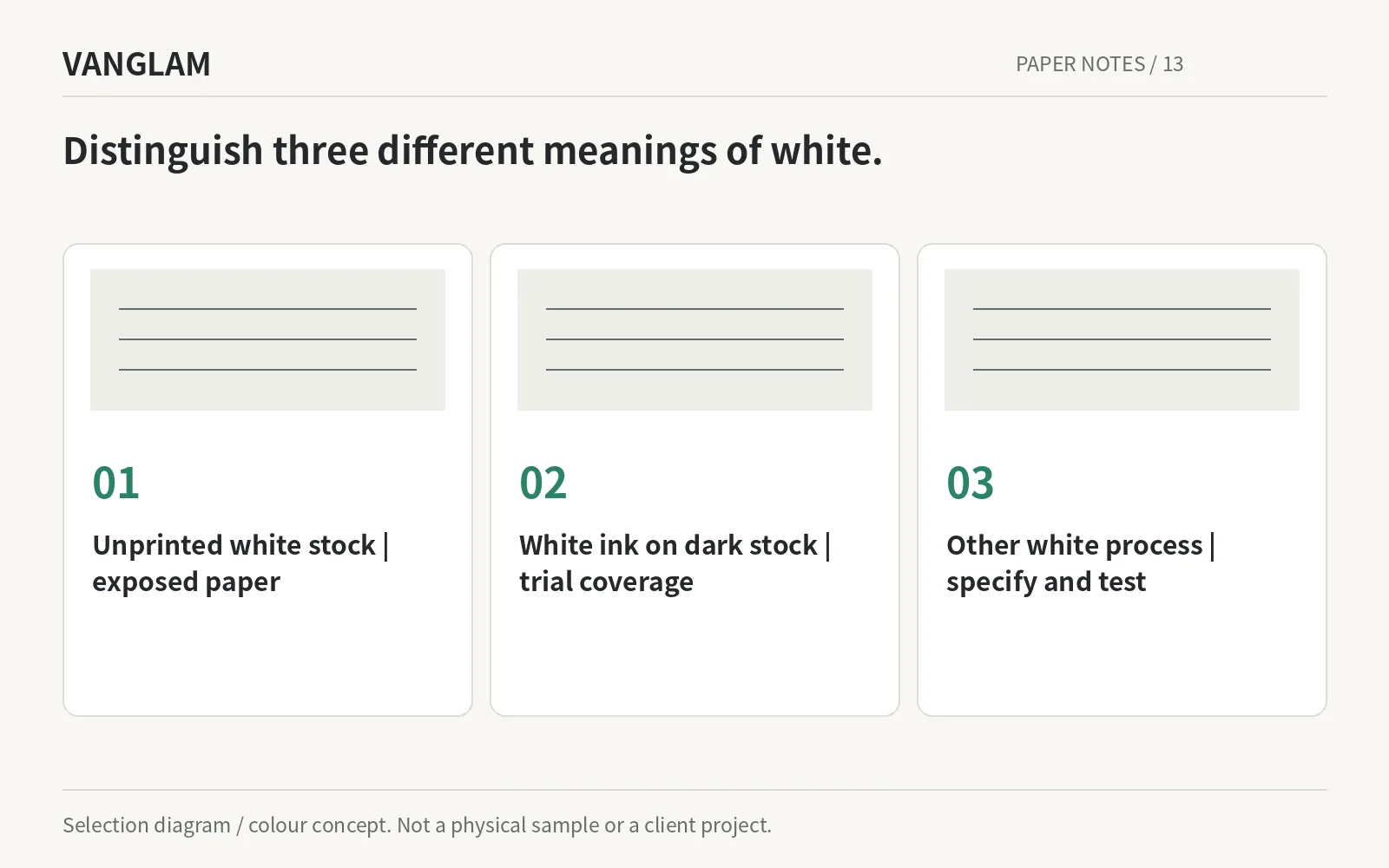
A line of white type on a dark background is simple to draw on screen. Producing it on a dark sheet requires a printing decision. With little text on a greeting card or invitation, it is worth considering the paper, type process and fold together.
White artwork is not unprinted white paper
On a dark sheet, white artwork needs an agreed white-ink or other opaque process. TAKEO’s opaque-ink example describes white areas that allow some underlying paper colour to remain visible as part of the intended effect.[1]
That is not automatically a defect. Decide whether the design calls for a softer white or stronger coverage, then trial the paper, process and final type size together. The objective is the intended result, not an assumption based on the file preview.
Original selection diagram / colour concept. Confirm paper, colour and processes physically.
Do not ask every effect to lead
Wisteria Mist 23 with Imperial Violet 24 can separate the invitation and envelope into lighter and darker components. Ultramarine 30 with Luminous Yellow 12 offers stronger contrast. For a warm-white direction, compare physical HALO Nacre White, Ivory Silk or Warm Porcelain samples.
For embossing or debossing, review the intended impression, type detail and reverse side with the converter. A general diagram cannot prove how a particular paper will respond, and “thicker is better” is not a substitute for a finished sample.
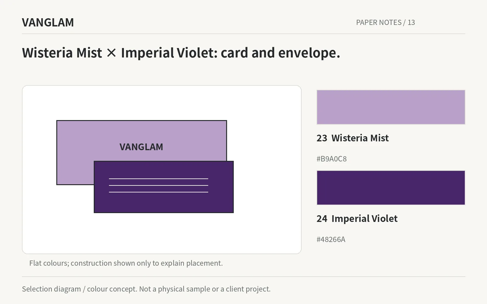
Original selection diagram / colour concept. Confirm paper, colour and processes physically.
Fold it and put it in the envelope
Check the fold, opening, handwriting area and fit in the envelope. For mailing, confirm the finished dimensions, thickness and protection with the intended carrier. A paper recommendation is not a postal-compliance guarantee.
QiLi’s coloured, white pearlescent and white printing-paper directions can be shortlisted for different parts of the set. With less text, leaving more material visible can be an intentional choice. It does not need to be compensated for with additional finishing.
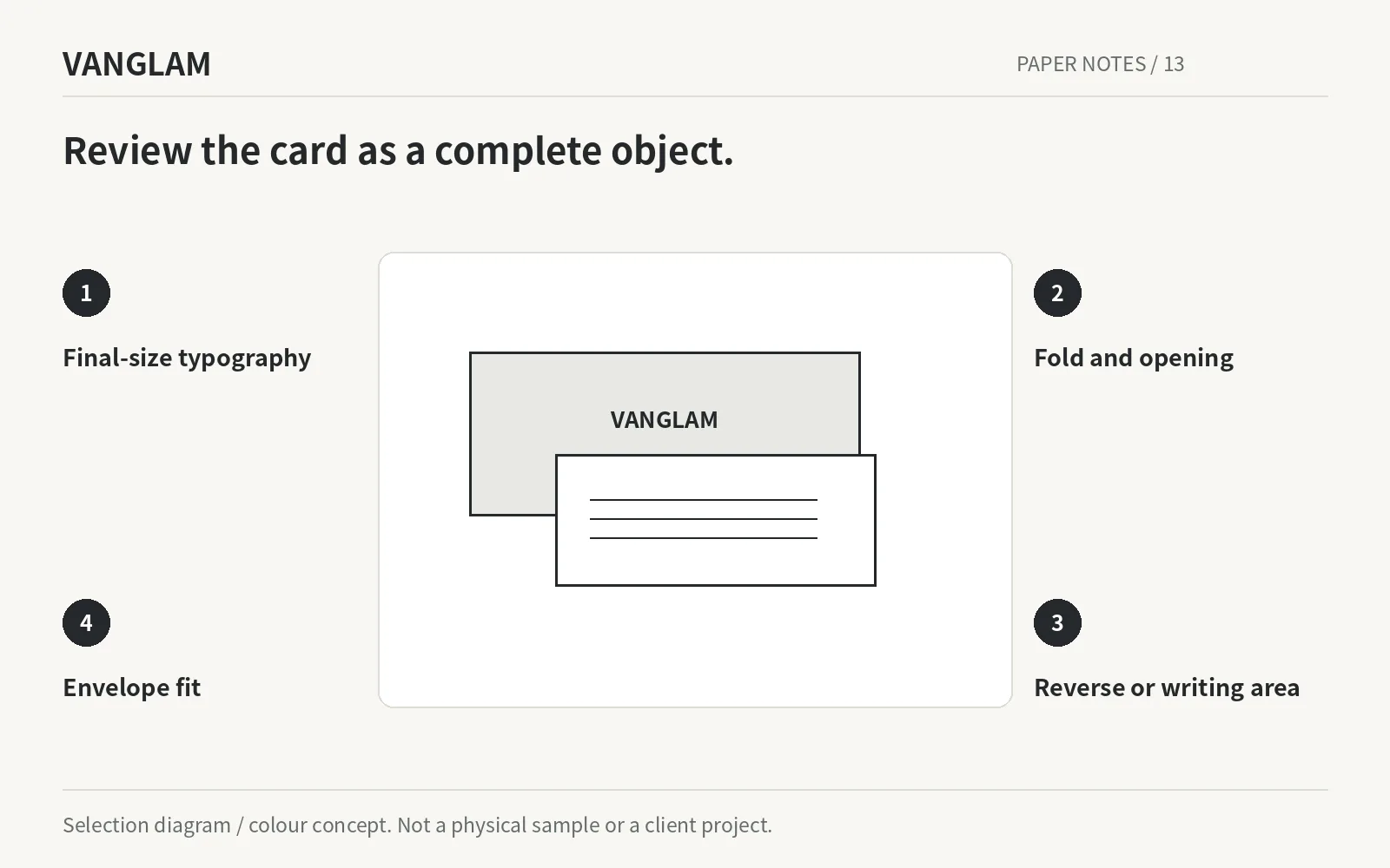
Original selection diagram / colour concept. Confirm paper, colour and processes physically.
For greeting cards and invitations, include the type process, fold and envelope dimensions. Review the complete piece before final approval.
References