
Sakura Blush, Rosewood and Wisteria Mist: Layering an Invitation Palette
Give the main card, envelope and reply piece distinct roles, then test the actual lettering and folds.
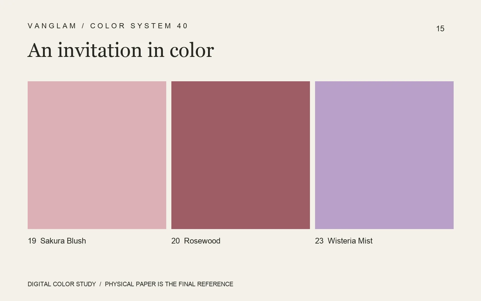
Give each piece a role
Colors 19 Sakura Blush, 20 Rosewood and 23 Wisteria Mist can start an invitation palette. One proposal is Sakura Blush for the main card, a small Rosewood seal and Wisteria Mist for the reply piece. Every component does not need to carry all three colors.
Return to the information
Check names, dates and addresses first. Then compare the area of the envelope with the card inside. Fine texture on a low-gloss colored sheet can sit quietly in the open space, but color cannot replace a clear reading order. If the set includes handwriting or a QR code, proof it with the intended pen and at the actual code size. Include folds, adhesive areas and corners in the complete mock-up.
FAQ: Is a heavier sheet always better for invitations?
No. The flexible character of 110 gsm and the more supportive feel of 240 gsm suggest different roles. Judge them within the envelope, card, fold and mailing combination. Availability of the selected color and grammage still needs confirmation.
Send QiLi Paper the full stationery list and artwork. Compare the sheet, printed proof and finished set together.
Cover: an original digital color study, not a physical paper specimen. Confirm color and surface with physical samples.