
Ru Celadon and Glacier Blue: color and touch for beauty packaging
Compare the two colors on physical paper, then add typography, handling and the opening sequence to the decision.
Start with the same paper surface
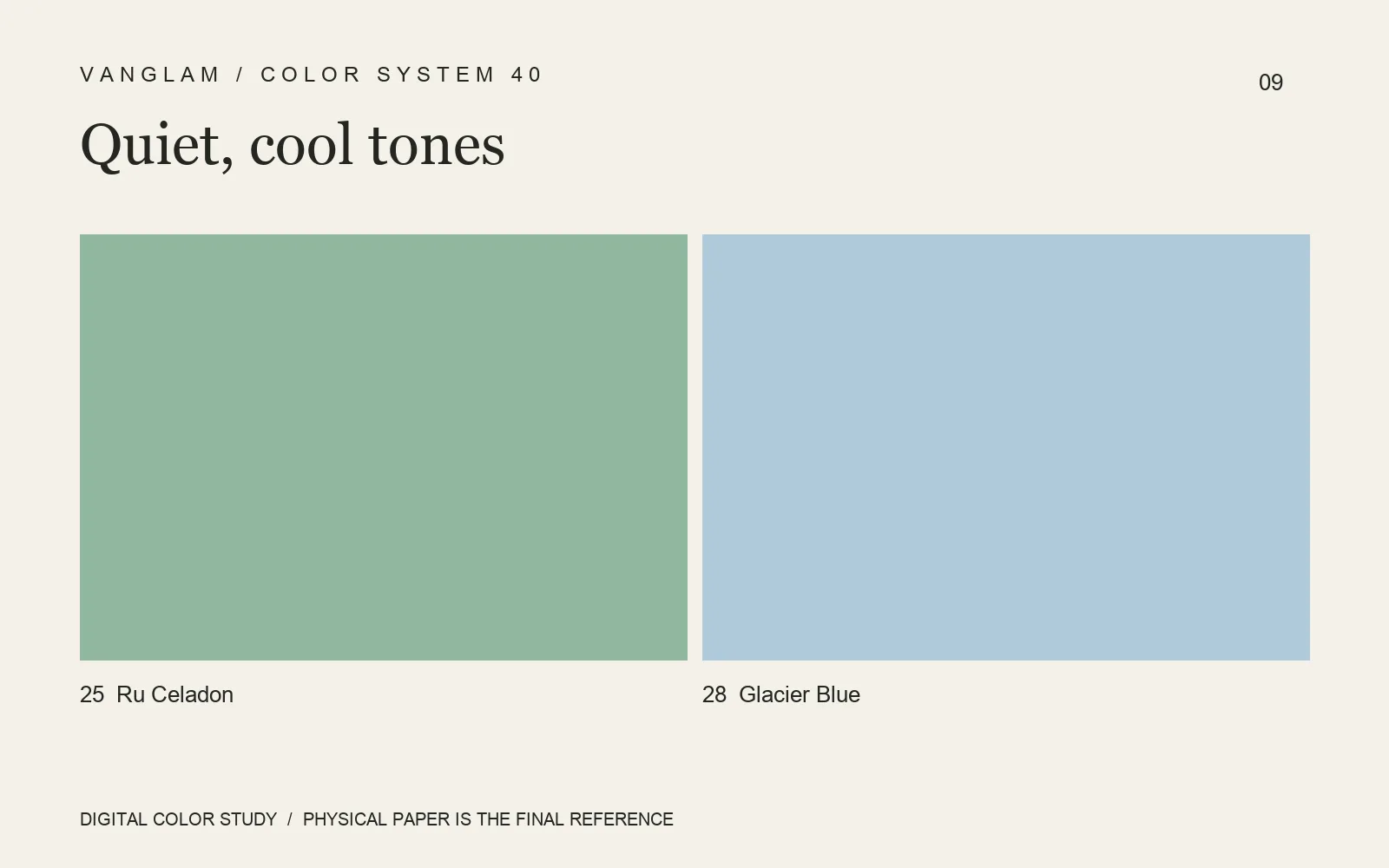
No. 25 Ru Celadon and No. 28 Glacier Blue offer an original color direction for beauty packaging. On PALETTE’s fine, level, low-sheen surface, compare each with the brand typography before assigning lead and supporting roles.
Include touch in the decision
Samples are more than photographic props. Read color face-on, use raking light for the fine texture, then handle the sheet to compare its dry, refined feel. Whether exploring the conformity of 110 gsm or the substance of 240 gsm, put the paper into the intended construction. A flat sheet cannot settle that decision.
Add 27 Deep Jade and 29 Mineral Blue to the sample comparison for a deeper green and another blue direction. Define the information hierarchy before choosing color areas.
FAQ: Do these colors prove gentleness or environmental benefits?
No. A color association is not evidence of product efficacy, composition or environmental certification. Confirm compliance and use requirements from the relevant material and project documents.
Decide with a small proof set
Request both colors and include fine type, foil, folds and bonding in the proof. Screens support discussion; physical paper and finished samples complete approval.
Cover: an original digital color study, not a physical paper specimen. Confirm color and surface with physical samples.