
Natural Fibre and Cashmere Camel: building a neutral paper palette
Compare paper, color area and typography before adding decorative elements to a neutral packaging concept.
Assign each color a position
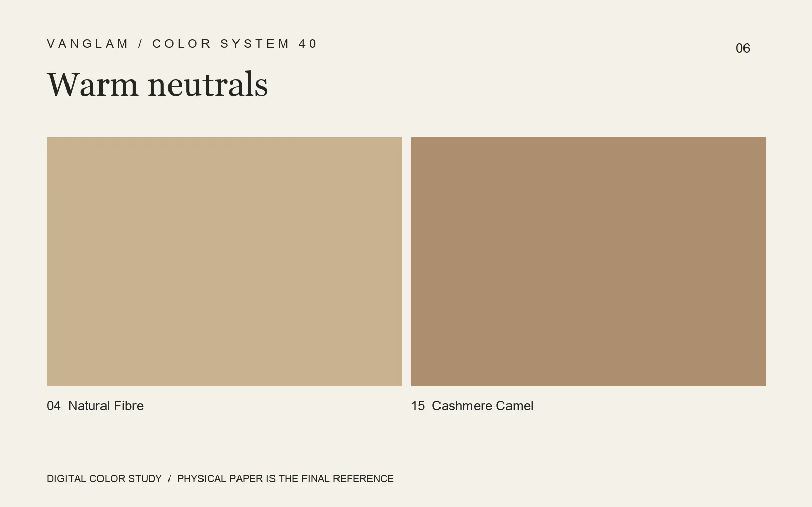
No. 04 Natural Fibre and No. 15 Cashmere Camel offer an original direction for neutral packaging. Use one for the main area and the other for a band, liner or information card. They do not need equal space.
Compare boundaries and layers
On PALETTE’s low-sheen surface, look at the shadow created by a fold, the relationship between adjacent paper edges and the contrast of type against the sheet. A simple exterior still needs clear information. A separate card can hold supporting copy while the outer piece keeps a readable focus.
Colors 05 Sandstone and 07 Almond Taupe can join the neutral sample comparison. Decide which area leads, then proof the identity and text.
FAQ: Does the name Natural Fibre mean exposed fiber particles?
No. It is a color name, not a specification for raw material or surface structure. Visible fibers, particles and other features must be checked on the selected physical sample.
Move from palette to proof
Request both colors and compare area, folds and print legibility. Digital references do not establish the final paper color. Confirm the grade, weight and supply conditions for the project.
Cover: an original digital color study, not a physical paper specimen. Confirm color and surface with physical samples.