
Luminous Yellow, Radiant Orange and Imperial Violet: Color for Exhibition Print
Use vivid colors to distinguish guides, event cards and identification pieces through area and reading order.
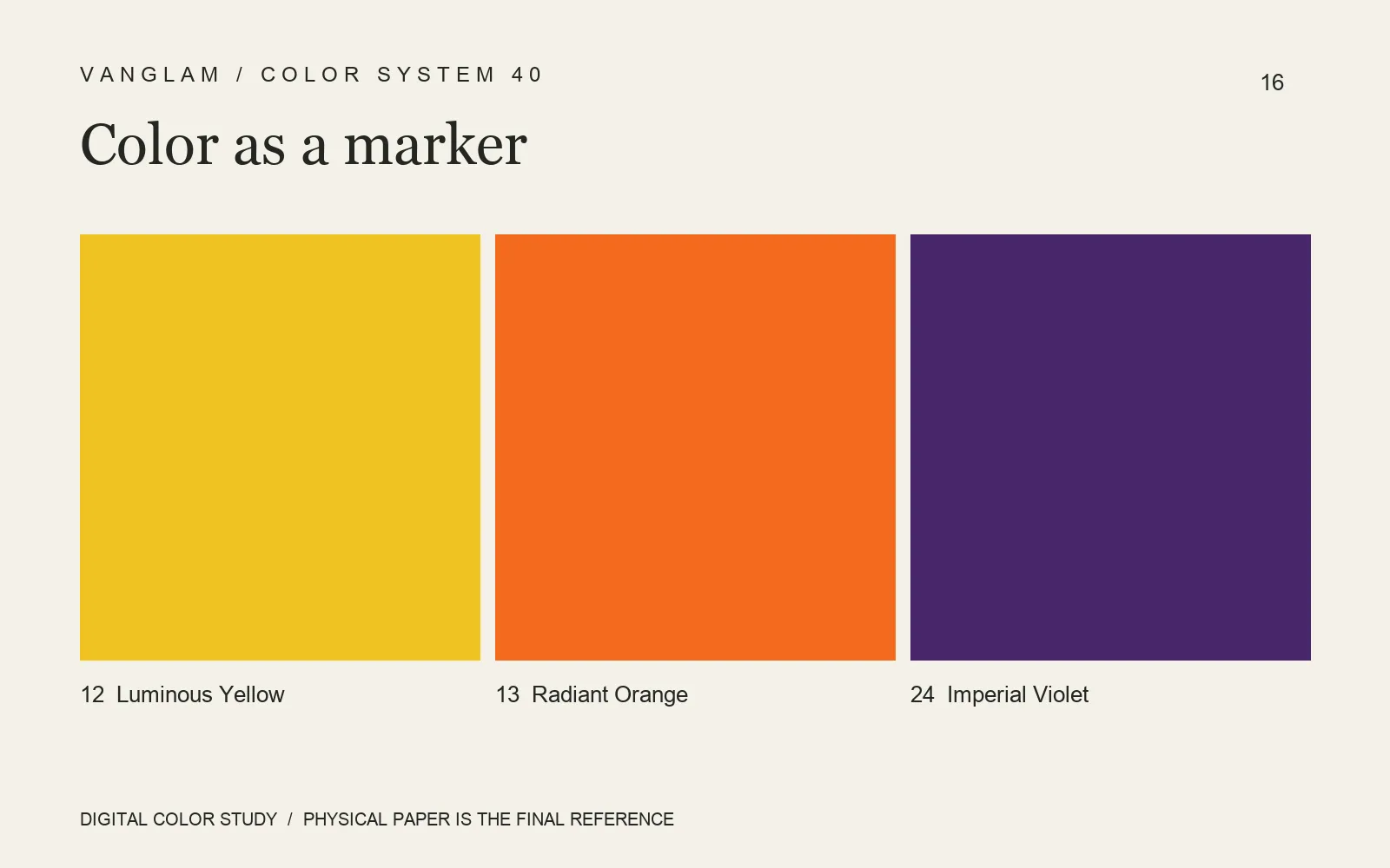
Leave room around a strong color
Colors 12 Luminous Yellow, 13 Radiant Orange and 24 Imperial Violet can enter a palette for exhibition guides, event cards and cultural print. Instead of dividing a sheet equally among all three, choose a primary color. Let another carry a number, an envelope or one specific cue.
Check the viewing distance
An exhibition piece may be read in the hand and displayed at an entrance. Use an actual-size proof to check the title, date, session and directional information. Then place it at the intended viewing distance. Fine type, QR codes and reversed lettering on a strong ground need a printed test, rather than approval from a monitor alone.
FAQ: Does a vivid color automatically improve identification?
No. Neighboring colors, type weight, size, lighting and information density affect the result. Color can help distinguish a piece, but important cues should also have words or numbers so that color is not the only signal.
Send QiLi Paper the dimensions, print method and display context. Request relevant samples and a small proofing run before approving the physical result.
Cover: an original digital color study, not a physical paper specimen. Confirm color and surface with physical samples.