
Beauty and Fragrance Packaging Paper: Review the Bottle, Box and Card Together
A silver cap, a warm-white bottle and a cool-white carton may each look convincing on their own. Together, they need another review. Paper selection for beauty packaging should not happen only on a flat artwork file.
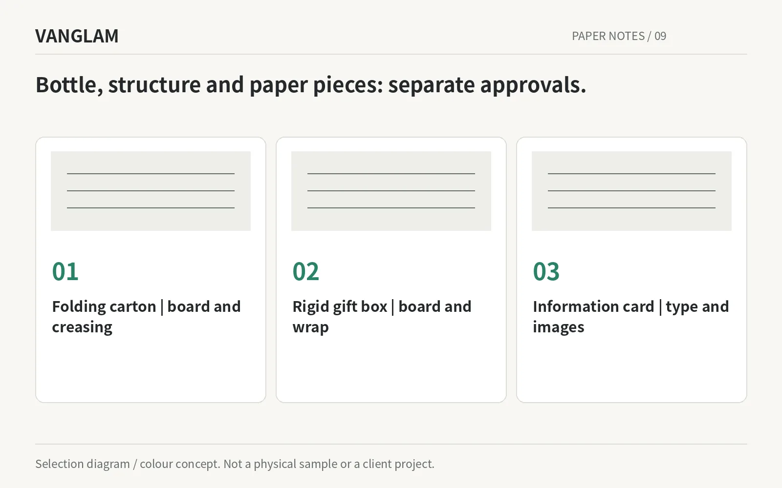
A silver cap, a warm-white bottle and a cool-white carton may each look convincing on their own. Together, they need another review. Paper selection for beauty packaging should not happen only on a flat artwork file.
Separate folding cartons from wrapped rigid boxes
A folding carton needs board selected for its construction; a wrapped rigid box needs its structure and wrap specified separately. This article concerns outer packaging and accompanying paper pieces, not materials in direct contact with a formula. A brand card is not automatically a fragrance-testing blotter either.
IMPRINT white coated papers can enter an image-and-text-led shortlist. Where more paper remains exposed, compare HALO white pearl, coloured papers or SOFTSKIN. The construction and artwork should explain why a material is being considered.
Original selection diagram / colour concept. Confirm paper, colour and processes physically.
Build the palette around the product
Ru Celadon 25 with Almond Taupe 07 is a starting point for a softer skincare presentation. Rosewood 20 with Cloud White 02 can be explored for lipstick gifting, while Deep Navy 32 with Cognac 16 is worth comparing beside a fragrance bottle. Use the product itself to judge those proposals.
Glacier Blue 28 offers another light-colour direction. Review Silver Grey 40 physically because its approved digital value is not included in the current publication data. A colour name does not establish a metallic finish, environmental credential or product benefit.
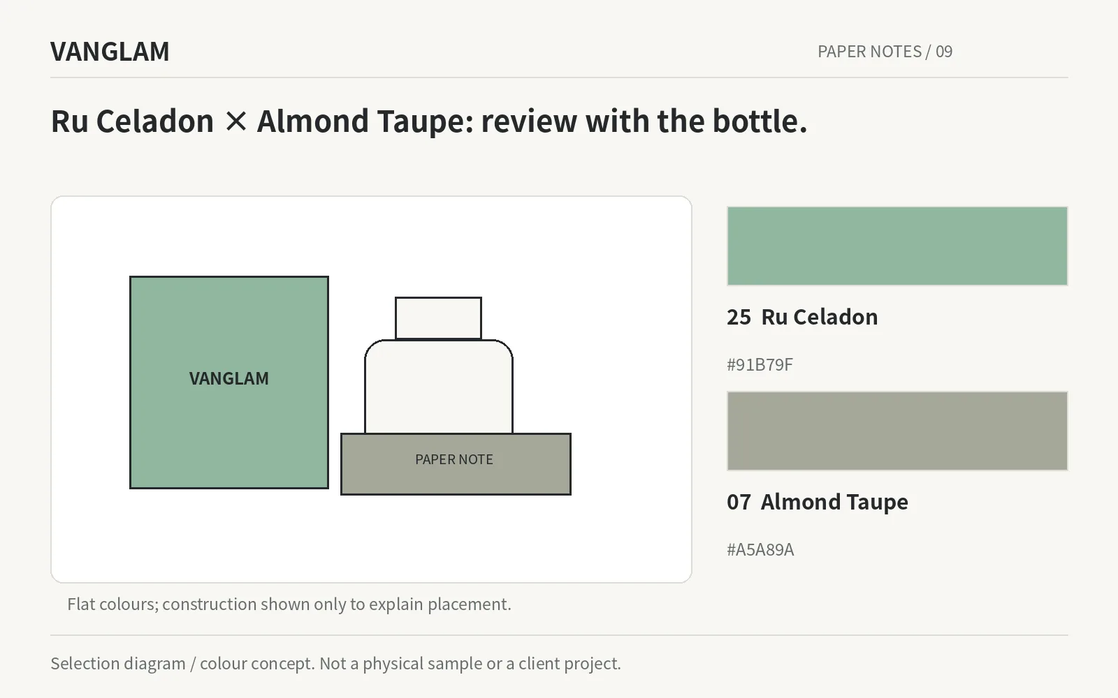
Original selection diagram / colour concept. Confirm paper, colour and processes physically.
Do not leave small type and codes until the end
The brand approves the required wording; the printer trials small type, fine lines and codes at final size. GS1’s guidance addresses contrast, quiet zones, size, position and deterioration, among other checks. The presence of a code in the artwork is not the same as verified print quality.[1]
Include creasing, gluing, surface handling and opening in the finished-sample review. Where pearl or texture is used, assess readability on the final grade and process. A phone scan can help with use testing, but it is not a substitute for a barcode-quality verification report.
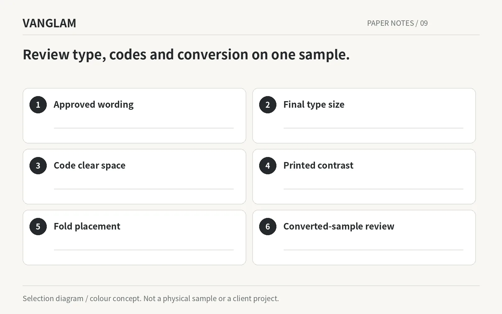
Original selection diagram / colour concept. Confirm paper, colour and processes physically.
Share the bottle, box construction, artwork and processes for a beauty or fragrance project. Start with a small, relevant physical shortlist.
References
[1] GS1 — What should I check to ensure good quality barcodes?