
Ink Black and Four Greys: Tonal Layers for Minimal Packaging
Compare Mist Grey, Smoke Mist, Graphite Grey, Ink Black and Silver Grey under the same light, then plan color area, small marks and open space.
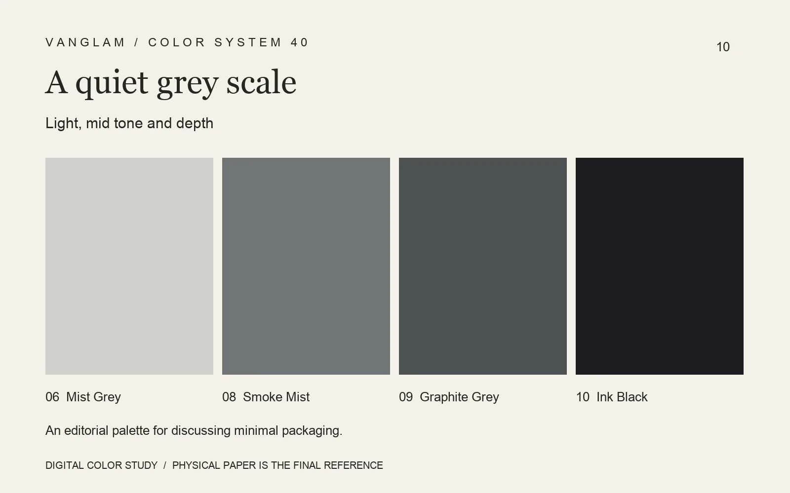
Begin with five physical sheets
Compare 06 Mist Grey, 08 Smoke Mist, 09 Graphite Grey, 10 Ink Black and 40 Silver Grey as a group for a gray-and-black packaging concept. Use the same light, background and orientation. Establish the tonal relationship from paper, rather than ordering the shades by name or screen appearance.
Let area establish a lead
Minimal packaging does not need all five colors at once. One might carry the box exterior and another a band or information card. A small mark can provide a reading focus. Check legibility and clear boundaries; arrange open space around necessary information without making the type too small.
FAQ: Why compare subtle greys under the same light?
Lighting, background and angle can change the viewing result. Consistent conditions reduce that interference before the team judges differences in paper color and surface.
Move into a construction sample
Request the five colors and compare neighboring edges, fold shadows and printed information. Silver Grey currently has no approved digital value. Do not substitute an estimated swatch for paper. Confirm the chosen colors, weights and processes through physical samples and project proofs.
Cover: an original digital color study, not a physical paper specimen. Confirm color and surface with physical samples.