
Deep Navy and Tidal Teal: Making Dark Brand Stationery Clear
Compare dark paper and light lettering through the practical roles of folders, cards and envelopes.
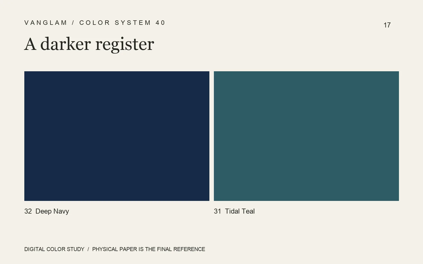
Assign color to a task
Colors 32 Deep Navy and 31 Tidal Teal can guide a brand stationery palette for folders, business cards and envelopes. Deep Navy might carry the main cover while Tidal Teal distinguishes an inner pocket or an accompanying card. A quieter option is one primary color with the second reserved for a small identifying detail.
Look at the contact points
Phone numbers and email addresses must remain easy to read. Folder folds, slots and edges need checking through actual opening and handling. Envelopes also require attention to adhesive areas and closure. When light lettering is needed, compare white ink, foil or another proposed process separately. Proof coverage, fine lines, adhesion and the result after rubbing. No single process is an automatic answer.
FAQ: Can one reference sheet cover every matching component?
Different grades, grammages or surfaces need their own references, followed by a comparison of the whole set. The distinct handling of 110 gsm and 240 gsm should not be assumed identical because a color name is shared.
Give QiLi Paper the stationery list and intended handling. Request color and process samples for the actual structures.
Cover: an original digital color study, not a physical paper specimen. Confirm color and surface with physical samples.